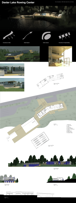
For assignment four, I designed my studio project in Revit. The project is a center for the crew rowing teams in the Eugene area.
As the lake is an integral part of the function of the building, the primary concept behind the rowing center was to create both a physical and visual connection to the water. Overall, I am quite happy with the way the project turned out.
Although I was somewhat apprehensive at first about using Revit for my final studio project as I could see myself running into questions about using the program that I would be unable to find the answer to, Revit proved to be an effective and useful tool in designing and modeling the building.
This class has been very helpful in better understanding and experimenting with Revit as a valuable tool in the architectural process. I look forward to continue designing with Revit and other advanced computer modeling programs.
It is said that using something is the best way to get better at it, and this has definitely proven true with Revit. Through using Revit to design my studio project, I have found the answer to many of the questions that I had about using the program, although some still remain.
One thing that I was very pleased to gain a better understanding of is the mass creation tool. Without using this tool, a Revit project is very limited to the forms and spaces that can be created and it will be very rectilinear and boxy. The mass tool allows more abstract shapes to be created and then fitted with structural elements.
The main mass that I created for the project was very simple, however, it opened my eyes to the possibilities of the tool. I needed to create a shed roof that was sloped in both directions. The mass tool was necessary to do this as it is only possible to create a shed roof sloped in one direction using the roof tool. I first created the rectangular shape of the roof in plan view, and then used the create form tool to make it into a three dimensional form. I then made the mass the same thickness as the roof would be. This was not completely necessary as the roof is later applied to just the top face of the mass, however, it was important in order to make sure that the bottom of the roof would be at the correct height after I added it. I then used a section view to make sure that it was at the proper level. I then pulled the corners of the three dimensional shape to the necessary heights to give it the correct slope in both directions. After this is it was just a matter of applying the roof to the mass. Deleting the mass after the roof is created is optional as it can be turned off in the view options.
In the future I would like to experiment more with creating even more abstract shapes in Revit. Using this tool has increased my optimism about the capabilities of the program and shown me that the options for creating different shapes are very open.
I still have some questions about the program, as some parts seemed like they could have been more intuitive. I am not sure, however, if this is due to the software or if there are more efficient ways to do it that I am unaware of.
Creating the slopes for beams and ramps has been one of the largest issues. In the case of beams, there is apparently some way to do 3d mapping and attach objects to other objects, however, I could not get this to work. It always seemed to be grayed out when I was trying to create a beam system. The way that I created a sloped beam would be to place the beam and then manually change the height offsets of the ends in order to have it be in the correct position.
My experience with ramps was similar to this as well. I would place the ramp where it was supposed to go and then manually change the offset heights to have it be in the correct position. Looking back at this issue, however, I am thinking that this could have been remedied with creating new levels at the correct heights and then locking the ends to those levels. It is something that I will look further into with my next Revit project.
Another aspect of Revit that can be somewhat limiting are the placing of components. This is because if you wanted to include a custom component as a part of your building, such as a shading device, furniture, or door handle, it is necessary to create the family yourself and then place it in your project. It is extremely time intensive to create all the custom families that you require. The best alternative is to load already made components included with the program or from sites such as Revitcity.com. For this reason, a lot of times the components don't perfectly match the architect's vision. Although this can be seen as somewhat realistic as in the real world you will probably not be able to design your own shading devices and such but instead buy them from a manufacturer, an architect such as Alvar Aalto would have to get very good at creating custom families.
In the future I would choose one or two components that were very important to my project and design them myself. I would then use the premade families for the rest of the components. If I was to continue this project I would custom design the glass curtain wall shading devices as this was a prominent aspect of the building's appearance. Luckily, after downloading and trying out many different shading devices from Revitcity I was able to find one that closely matched the appearance I desired.
Another aspect of Revit that I was pretty impressed with was the ability to modify the view options, such as turning off annotations and changing the line weight, colors, and fill patterns to create a drawing that could be exported into illustrator and look very good on a presentation.
For architectural drawings, I used Cutepdf to print the drawing to a pdf file, I then opened it in illustrator and then exported that to Photoshop. For the renderings and drawings with color fills such as elevations, I exported the file as an image to Photoshop. One problem I had with exporting pdfs to Illustrator was that although they looked very good, it was very difficult to create fills and modify lines as most of the lines became a bunch of smaller lines rather than one continuous one. It is probably possible to export the drawings in a more efficient manner and it is just a matter of looking further into it.
I was impressed with Revit's capabilities in constructing an architectural project and as a design tool. One very useful aspect of the program as opposed to using hand media was the ability to get immediate visual feedback using the three dimensional and camera views during the design of the building. This helped to influence various design decisions during the construction of the model.
In the future I would definitely use Revit again to design a project. My skill with the program has greatly improved and the creation process would be much more streamlined. I would also like to experiment with other three dimensional modeling programs designed for more unconventional building forms such as Rhino.
As a precedent for my presentation, I used a poster board from Locus Graphic, which is a company that designs digital presentations for various types of companies. This presentation board is for an architectural firm that designed the Alcoa Corporate Center. 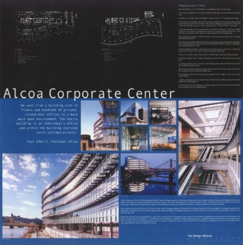 Courtesy of Locus Graphic I like the use of two different colors that divides the page into two distinct parts. It does a good job of creating a visual separation between the architectural drawings and the perspectives. I also like the use of the large number of perspectives to explain the building. One of the strengths of Revit is creating perspectives, so this is something I would definitely like to emulate in my presentation. I also like the hierarchy of the perspectives in the way that the different sizes guides the eye in a manner that successfully explains the space.
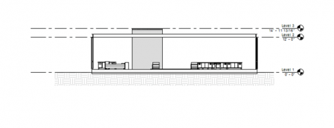
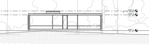
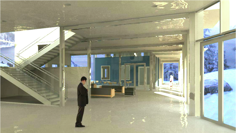
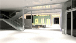
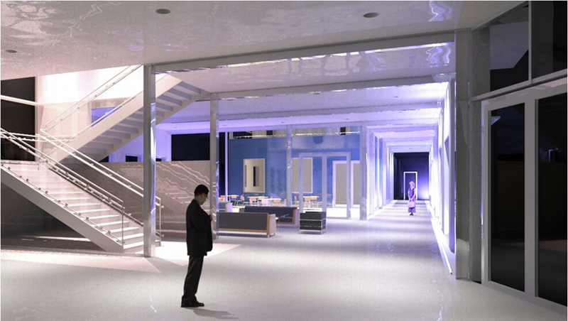
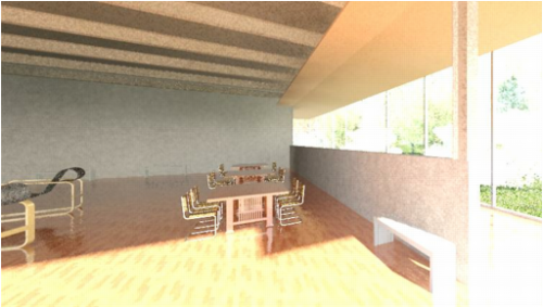
This assignment seemed like a great opportunity to experiment with artificial lighting in Revit as I have only done renderings with exterior light so far. It was also a great opportunity to begin rendering my current studio project, which is a crew rowing center and boathouse on Dexter Lake near Eugene. The view that I chose to render was from the entry lobby of the building.
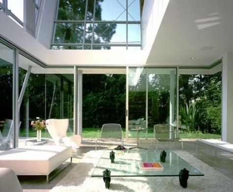
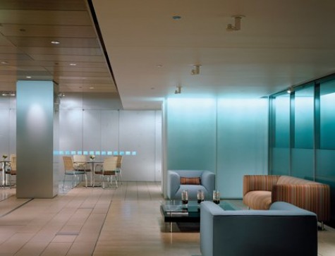
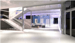
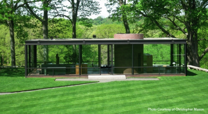
For my daylighting precedent image, I chose an interior with alot of views to the outdoors and no use of artificial lights, as this reflected the aesthetic that I am aiming towards in my studio project. For my night rendering, I chose to emulate an image that utilized white and blue colored lighting to accentuate the space. Also, since the building is a boat house, the somewhat aquatic looking effect would be appropriate.
I did not have too much trouble with the exterior lighting rendering. I turned off the artificial lights as I wanted a clearly lit daytime space that contrasted with the more dynamically lit nighttime space.
One problem that I did have involved placing an exterior background image into the rendering. I read in someone's blog post that if the rendering was exported to photoshop as a png and then the background layer was transformed into a normal layer, the sky would be transparent and another image could just be placed underneath the building. For whatever reason, this did not work for me and I insead used the selection tool to select and then delete the areas of sky in the windows and then placed the background image underneath. This did work, however, I definately want to figure out how to make the original background transparent for future renderings.
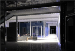
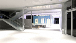
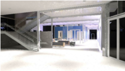
The night image was a little more tricky as I have not worked with artificial lights in Revit yet.
My first immediate problem was that the light from the recessed luminaires was not showing up. I eventually realized that this was because my cieling was directly under the concrete floor above it and thus the lights were embedded in it. Recessed lighting fixture components cut holes in cielings but not floors. Lowering the cieling would have solved this problem, however, then the beams that I wanted exposed would be hidden. For this reason, since the second story floor is not visible in the view, I temporarily deleted it for the rendering. Next time I will just go into the view properties and temporarily hide the floor as I read this also works.
After this problem was taken care of, the preliminary renderings were so unsatisfactory I didn't even save thumbnails of them even though I probably should have to show my process. The images came out extremely dim and orangish yellow.
I was able to increase the lumen output of the lights greatly through the element properties interface. This solved the brightness problem. To solve the color problem, I raised the light temperature in the element properties interface to be closer to daylighting. This was an interesting process because I had to apply what I had learned about lighting in environmental control systems in order to get the look that I desired.
After this was resolved, it was just a matter of playing with the amount and strength of the lights, and then placing wall washing blue colored lights to create the more dynamic effect.
As far as design changes for my studio project go, this project was helpful in illuminating some apparent problems. First of all, The interior is too stark white and the use of more timber for surfaces such as the floor will give it more of a boathouse feel.
The firm, Attention Deficit Disorder, or "ADD," (har har), gave me a lot of optimism about the capabilities of Revit. Most of the firms that we have had visits from in the past in this class have also shown impressive examples of Revit in the workplace, however the buildings they presented were very rectilinear. It seems that the firms who presented chose to use Revit in cases where the design of the building was more conventional. This, along with my own use of the program, has shown me that Revit caters more towards conventional building types.
However, the buildings that ADD displayed seemed as if Revit's tendency towards rectilinear buildings did not impact their designs. The first building had a gently sloping and curvilinear projection along the second story that seemed very natural and probably transferred smoothly from a conceptual idea into the computer program. This shows me that the abstract form tool can be used in an effective manner to create unique building shapes and makes me want to delve into the tool further.
I was also impressed with their use of Revit on the multistory building. It seemed as if they used the capabilities of Revit to their advantage in designing this building. The window pattern on the building was somewhat modular, using the same window type arranged in differing positions to create a interesting facade. Using Revit allows for experimentation with different placements of the windows much more effectively than having to redraw the different schemes by hand or even with AutoCAD. It also provides instant three dimensional visual feedback on a particular elevation scheme.
On a side note, I was also impressed with their use of composite metal panels in their facades. I have seen this material on buildings in the past and thought it allowed for a very appealing and modern aesthetic. I wanted to use it in my studio project this term. I was in the process of figuring out what this material was called and this presentation gave me the answer.
In Revit, one of the material choices is a metal panel. I am assuming that they started with this material and then played with the rendering options to get the appearance they desired. I am also wondering if composite metal panels are commonly used for interiors, or if there is some kind of variation of it, such as a composite plastic panel that is more often used.
To create a context for the Revit families, I constructed an interior space from my current studio project. I placed the Husser table family that I created in the room and set chairs from the Revit family library next to these. I used Sina Meier's bench family, which i think compliments the aesthetic of the building quite well, and I also used Joshua Kolberg's Aalto chair, which also has a modern aesthetic that matches the building.
Creating the context for the families also reminded me how much more streamlined and intuitive the building design tools are compared to the family creation tools, which don't seem quite as polished.
For the Families Assignment, I decided to create Frank Lloyd Wright's Husser table. Its design is reminiscent of his similarly flat and sturdily proportioned houses. 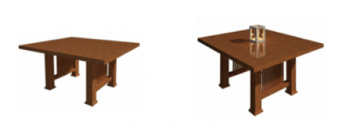 The 'Husser Table' Family and the Table with the Nested 'Candle Holder' Family 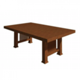 The 'Husser Table' Family with Modified Table Thickness and Width Parameters 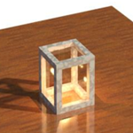 Close-up of Nested 'Candle Holder' Family This assignment was more complicated for me than the last assignment. I imagine this is partly because we are getting into the more advanced aspects of the program and also because it is so different than any other program that I have used. Constructing the building model in Revit was less complicated than this because the method of constructing the building mirrored the way it would go together in real life. This project was also complicated by the fact that I am used to making these types of objects in programs such as sketchup where the process is very different. Revit seems to be more involved, as I had to constantly switch between the different elevations, plans, and three dimensional design space in order to create the shape I wanted. However, when making the candle holder family after constructing the table, the process was much quicker and I was able to create the shapes that I wanted to more efficiently. For this reason I am hopeful that creating more advanced families in Revit will just be a matter of practice. An aspect that I thought was very cool about making families in Revit was the ability to allow people to use and alter your family just by typing different measurements into the parameters. Allowing the dining table to be quickly altered in size while maintaining its overall form is a feature of Revit that is done quite succesfully. With my Husser table family, the table-top and the width of the table can be altered. One aspect of families that I would like to learn more about is creating families that have curved shapes. There is probably an effective way to do this that I am not yet aware of, as I was experimenting with this process for a while and having alot of trouble. This was because I could not figure out how to assign dimensions to the curved shapes I made and thus could not figure out how to create modifiable parameters for them. One tutorial that was very helpful for this project was David Fano's tutorial video on creating Families at http://designreform.net/2009/01/revit-family-basics/. It was very helpful in crystalizing the most important aspects of creating families. This experience of doing this project was quite interesting since it was so different from using other architectural programs in the past, and it has given a better glimpse into the breadth of the program.
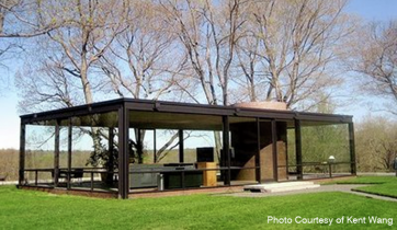
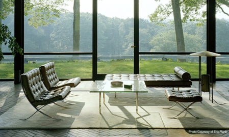
The Glass House is a home designed by the architect Philip Johnson. It is unique in the way that except for the bathroom, it has no opaque walls, only glass curtain walls.
Working on this project has caused me to become very impressed by the ability of Revit to stream line the post-conceptual part of the design process. The ability to take drawings on paper and transform them into a three dimensional representation of the building composed of the actual components that it would consist of if it was constructed is a powerful tool. Photos of the Actual Building:
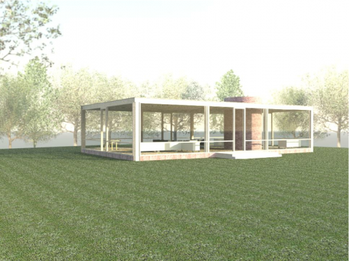
Drawings of The Glass House Created in Revit: 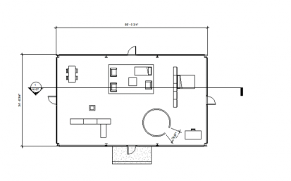 Plan
 Section A107
 North Elevation
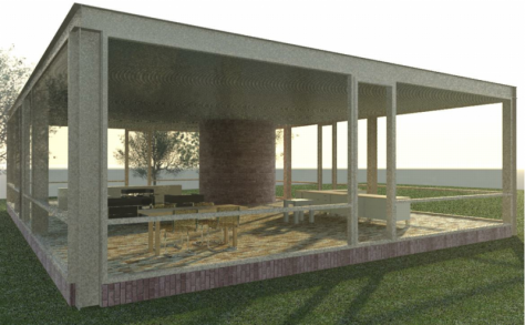
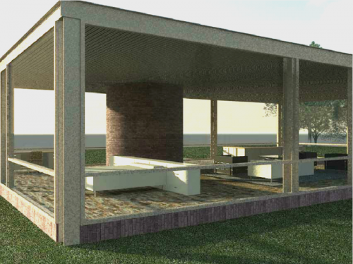
Renderings of The Glass House created in Revit:
The architecture 424 class has been a great resource in learning to use Revit. The lessons that we learned about modifying element instances and types to create custom objects were very helpful in the undertaking of this project. One reason this was important was due to unique doors that reach from the floor to the ceiling. Another place that this was crucial was in creating the custom floor and ceiling slabs.
The intuitive interface and informative help menus have also been a great resource. For example, one aspect of the building that I was unsure about how to model was the glass doors in the curtain walls. By using the help menu, I was able to discover that this was accomplished by selecting one of the panels of the curtain wall and changing that part of the glass into a non-curtain wall. It soon became apparent, however, that since I created my curtain wall without using a preset curtain grid, my curtain wall was not divided into selectable panels. However, thanks to additional use of the help menu and the intuitive interface, I was able to discover that I could use the openings tool to remove the area of the curtain wall I needed gone, place a non-curtain wall in that void, and then place the custom door.
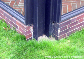
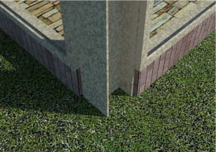
One interesting aspect of designing this building was having to discover how the building was actually put together. This was because the building is not constructed using the conventional residential method of using supporting walls. In the end it was apparent that the building's columns are standard wide flange columns and that it has 4 wide flange beams along the exterior edges. This in turn supports a reinforced concrete ceiling slab, which all rests on a brick floor slab, which then rests atop an additional concrete foundation slab.
This photo of one of the corner columns alongside the same view in the Revit model illustrates the way the exposed columns and window mullions meet.
One aspect of Revit that I would like to become more knowledgeable about in the future is rendering. Although I am pleased with how the renderings came out, some aspects could have been more true to the actual building. For example, the steel of the actual Glass House is painted black, while the steel in the Revit model is not.
As we begin to delve into Revit, I am pleased to see that the user interface is very similar to the AutoCAD interface. The menus are also intuitive and easily navigated by first choosing a main category from the upper tabs, and then narrowing the categories down to a final specific command. Without prior knowledge of Revit, most commands that I am instructed to carry out can be found relatively easily. Revit will undoubtedly get more complex, however, as we explore aspects of the program that differ greatly from AutoCAD and Google Sketch-up.
Another aspect of Revit that has become apparent as we begin to explore it is how effective it is in streamlining the design process. It differs from AutoCAD and Google Sketch-up in the way that the plans, sections, and detail drawings are being created along with the three dimensional model of the structure. As the model is created, the floor plans are drawn up, and I only need to show where I want to cut a section or have a detail drawing to have it created.
Another way that this program streamlines the design process is due to that the three dimensional models are made up of actual structural parts. When you draw a wall or window, the program automatically knows the all the properties of that component, and this can be used later to gather structural, environmental, and other vital data about the structure.
One aspect of Revit that concerns me as far as its potential as a design tool is whether the component based design process will limit creativity due to constraints on what shapes can be created. Our instructor, however, told us about a tool to create abstract shapes that the structural parts can then be adapted to, and I am interested in experimenting with this aspect.
I am very excited for this class, Revit seems like a very useful program that will be helpful in my future as an architect. I have some experience with computer drafting and modeling programs that will hopefully contribute to my understanding of Revit.
I have experience using AutoCAD. AutoCAD was created by Autodesk, which is the same company that designed Revit. I am very comfortable with AutoCAD with two dimensional designs, as I have used it for a number of years. The user interface for Revit appears to at least be superficially similar to that of AutoCAD so hopefully this experience will translate to understanding Revit.
One thing I have not done with AutoCAD, however, is utilize its three dimensional design tools. It would be interesting to become better acquainted with this design tool as well in order to better understand the advantages and disadvantages of the two different approaches to three dimensional modeling.
The only other three dimensional modeling program I have used in the past is Google Sketch up. I have only used Google Sketch-up once, however, to create a space that was actually rendered in order to create a final image for a project. Furthermore, it was done for a very simple building, and I rendered it using only the "Dennis Effect," in Photoshop. The majority of my sketch up experience has been with creating spaces that I later traced in pen and then rendered with hand media.
Revit is different from Sketch-up, however, in the way that Sketch-up uses lines and geometric volumes in order to create three dimensional designs, and Revit assembles actual building elements to create a three dimensional volume. Hopefully, however, my Sketch-up experience will help me in understanding Revit.
I am excited to learn Revit because it will be an additional way that I can visualize my designs in three dimensions, and it will also be an additional three dimensional modeling tool that I hope will allow me to create final rendered images that are superior to other three dimensional modeling programs.
|
 RSS Feed